Spring is full of vibrant colors that bring Boston back to life after the long winter, and Pantone’s color of the year, Veri Peri (short for periwinkle), certainly doesn’t disappoint. This lovely lavendar-lilac hue is infused with energy that exudes happy vibes, while also delivering a modern, youthful pop that simultaneously pairs well with classic neutral tones to create endless combinations of dreamy decor statements both inside and outside your home.
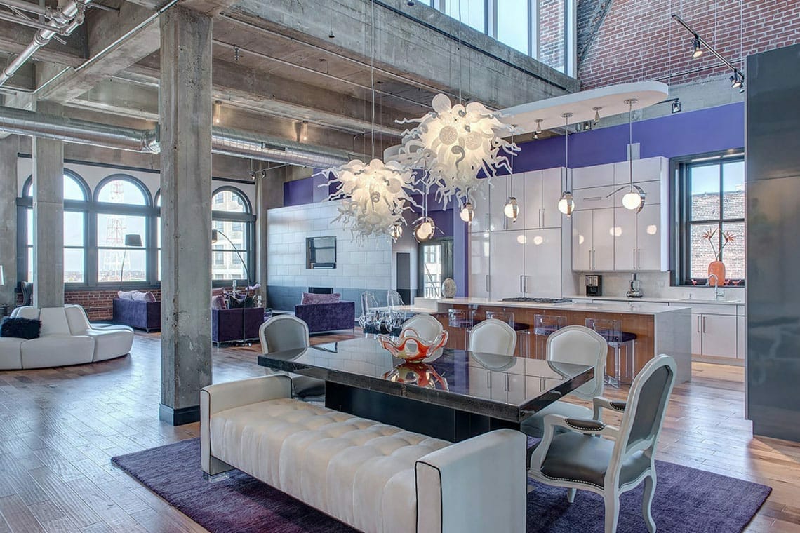
Veri Peri Neutral Loft via Decorilla
The above loft is a stunning example of how perfectly this high-impact color can be worked throughout an open concept living space to showcase modern sophistication and elegance. The bright accent wall acts as a backdrop to the white, airy kitchen, while the cozy far-nook of living room chairs with oversized pillows in hues of violet compliment the cooler tones, to the dining area rug that grounds the neutral formal pieces on top of an island of deep purple. Each purposeful choice makes it’s own individual statement yet unites everything together into one breathtaking concept.
The use of gray, white, browns and black helps to balance out the design and who can miss those exquisite chandeliers that draw the eye up around the room with a warm glow of light. The additional spot use of apricot in the vase and flowers in the kitchen window and coral in the ornate glass dish on the dining table show just how surprisingly versatile this color can be.
DREAMY NEUTRAL COMBINATIONS
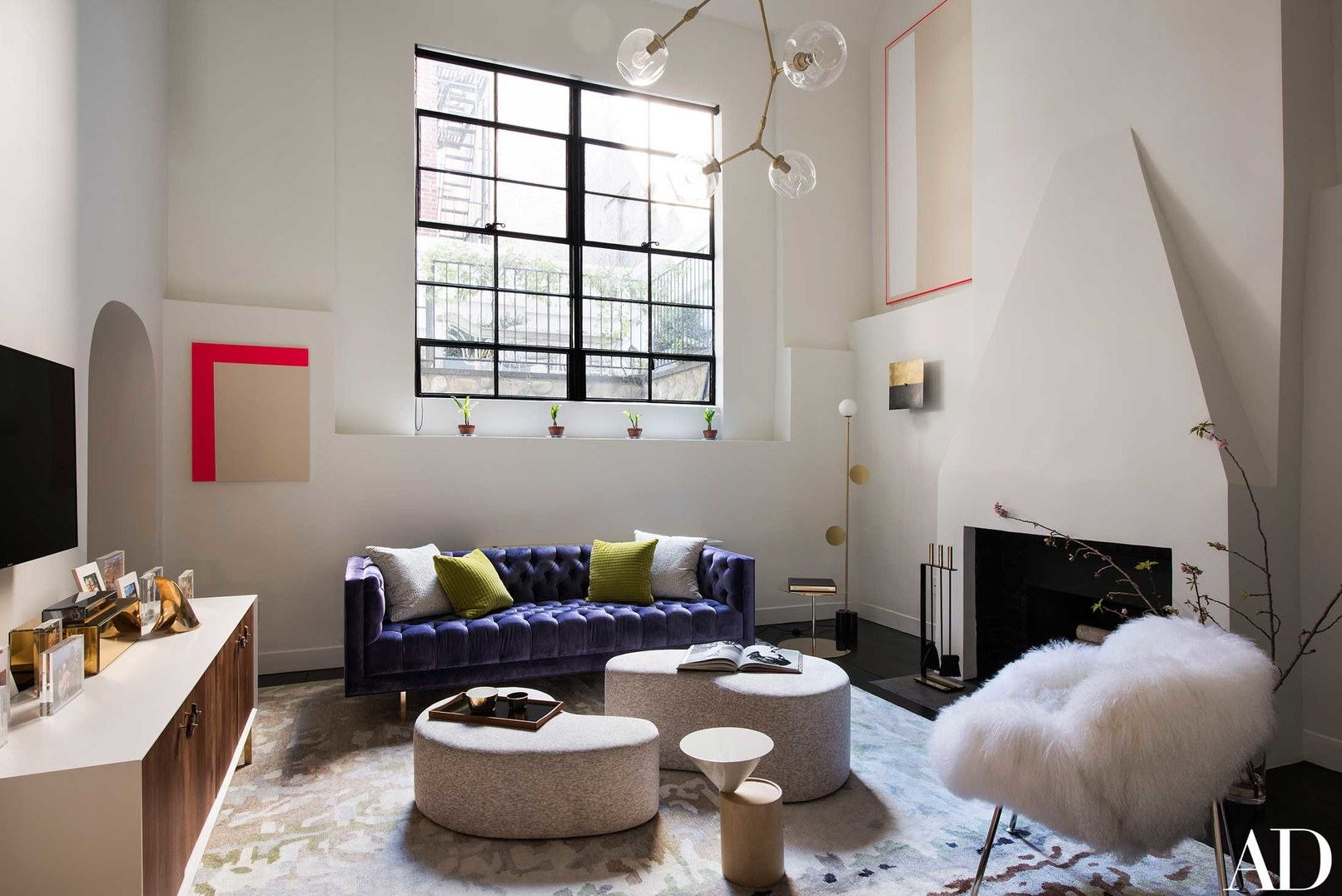
Contemporary Living Room Veri Peri via Lucy Harris Studio
We love the playful use of purple, green, red, gold coexist with the natural textures and shapes in this living room styled by Lucy Harris. So chic and contemporary, without missing a bit of inviting comfort.
The mix of bold elements is both youthful and timeless.
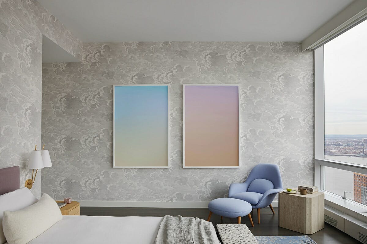
Inspiration via Clover Home Leisure
Craving a softer setting for a soothing bedroom setting? Choose a white-on-white patterned wall paper, dark hard wood floors, light natural wood accent tables, and pair them with a muted plum headboard, periwinkle side chair, and gradient artwork. It doesn’t take a roomful of detail to work this color into your palette.
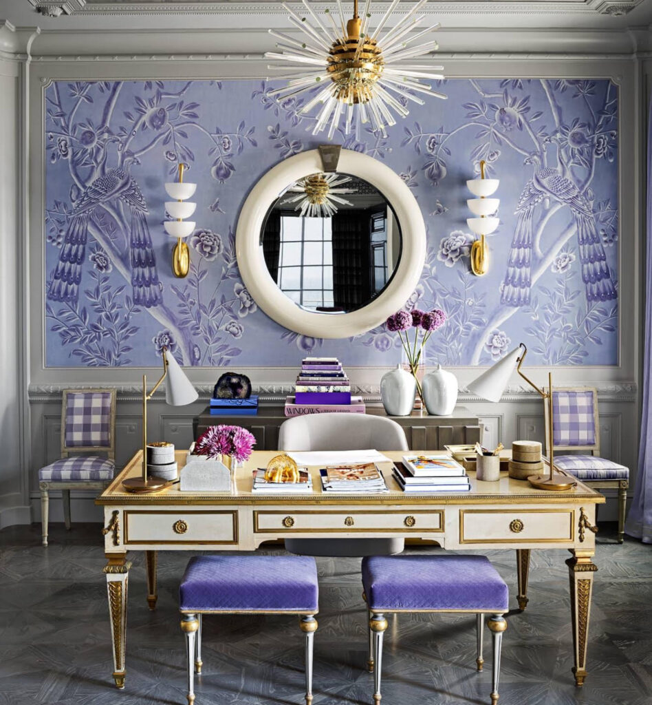
Glamorous Home Office via The Glam Pad
AMP UP YOUR WORK SPACE
You may not initially think this color works in a serious setting such as a home office or work space, but we would suggest you reconsider your take.
Pantone’s color is chosen only after some serious analysis of current events and trends that span over nine months of evaluating everything from economy to technology, from fashion to films and global cultures. Anything that impacts the world, can play a part in impact Pantone’s color choice each and every year.
Veri Peri is carefree, curious, confident and daring and embraces the essence of growth and change. The color also transforms well from the digital to physical worlds, which makes it a modern futuristic color companion. What better way to showcase your business to clients, or even to inspire yourself daily through visually symbolic affirmations in the form of color.
Although this color is bright and cheery, it’s rich in depth and the undertones of blue keep it classic and inviting making it a perfect shade to work with, home or office.
METALLICS, TEXTURES & PLAYFUL PATTERNS
Metallic Wall Paper via The Glam Pad
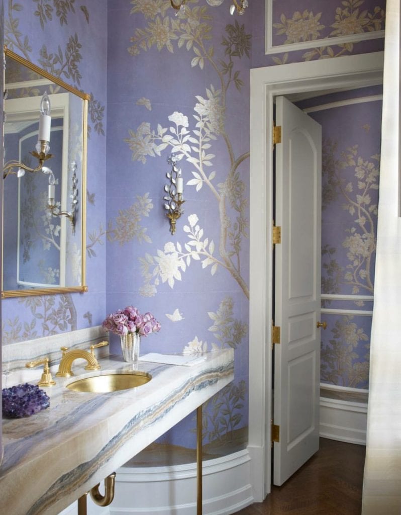
We love the way metallic details pair with this whimsical color. Wallpapers are trending now with their peel-and-stick versatility so different from decades past. Choose a glittering patterned paper for a hallway, back splash, foyer, stair way, or bathroom nook. Surround it with traditional molding, stone, marble, brass, silver or gold elements to add interest with contrasting textures.
Speaking of texture, pattern and metal…. Check out the gorgeous, yet somehow simplistic use of this color in the living room below. Grand mirror and wall sconces surrounding a white-on-white mantel of stone and custom wood moldings, setting off one single Peri-purple chair arm chair atop a gold and gray neutral patterned rug. Brilliant!
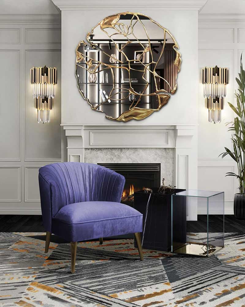
Statement Mirror and Veri Peri Side Chair via Bocadolobo
NOT JUST FOR INSIDE
These tones are not only beautiful in your interior spaces, but there are so many ways to use this gorgeous color in your exterior as well. Some could be in ways that mother nature is already offering in your landscape.
How to Use Pantone’s Veri Peri via Bob Vila
Looking for max curb appeal? Try painting your front door in one of these lilac, lavendar, plum or purple jewel tones. All it takes is one strategic spot to make an impact. Pair it with a pot of colorful wildflowers, or a container of annuals, or a hanging basket… or all of the above!
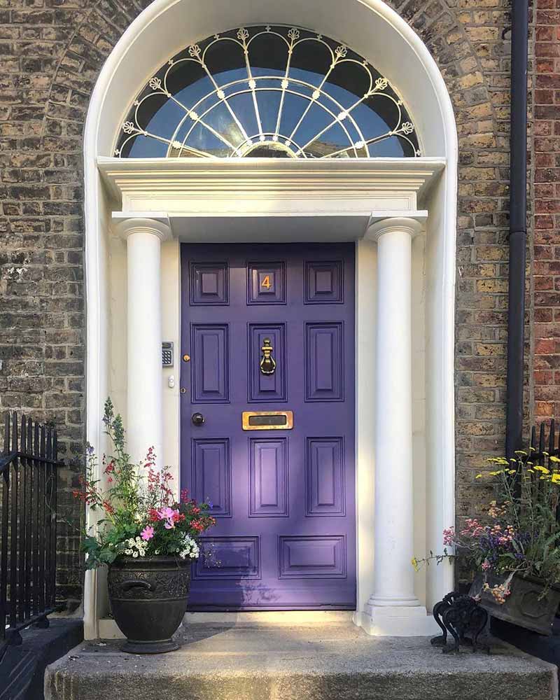
Purple Peri Front Door via The Cottage Journal
Not quite ready to commit to your front door? Opt for a waterfall of purple-toned Wisteria cascading along a front wall, fence or trellis instead. This creates an equally dramatic affect, yet offers a dreamy waft of spring perfume as a bonus to you and your neighbors! Check out this handy guide an how to grow this fabulous, fragrant flowering vine by Den Garden.
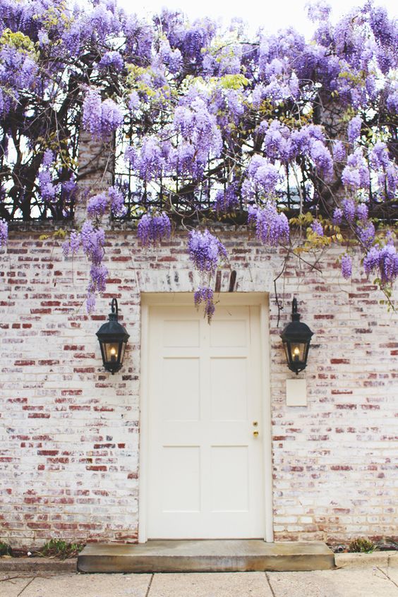
Purple Wisteria on Vintage Patina Brick via The Pretty Crusades
If outdoor charm tickles your fancy, try a collection of Adirondack chairs in assorted colors around a water feature, a large shade tree, along a deck or surrounding a fire pit. These brightly colored chairs come in the happiest array of colors we’ve seen, including a gorgeous pop of purple-y plum!

Daybreak Adirondack Chairs via Martins Furniture

Purple Peri Plum Folding Adirondack via Martins Furniture
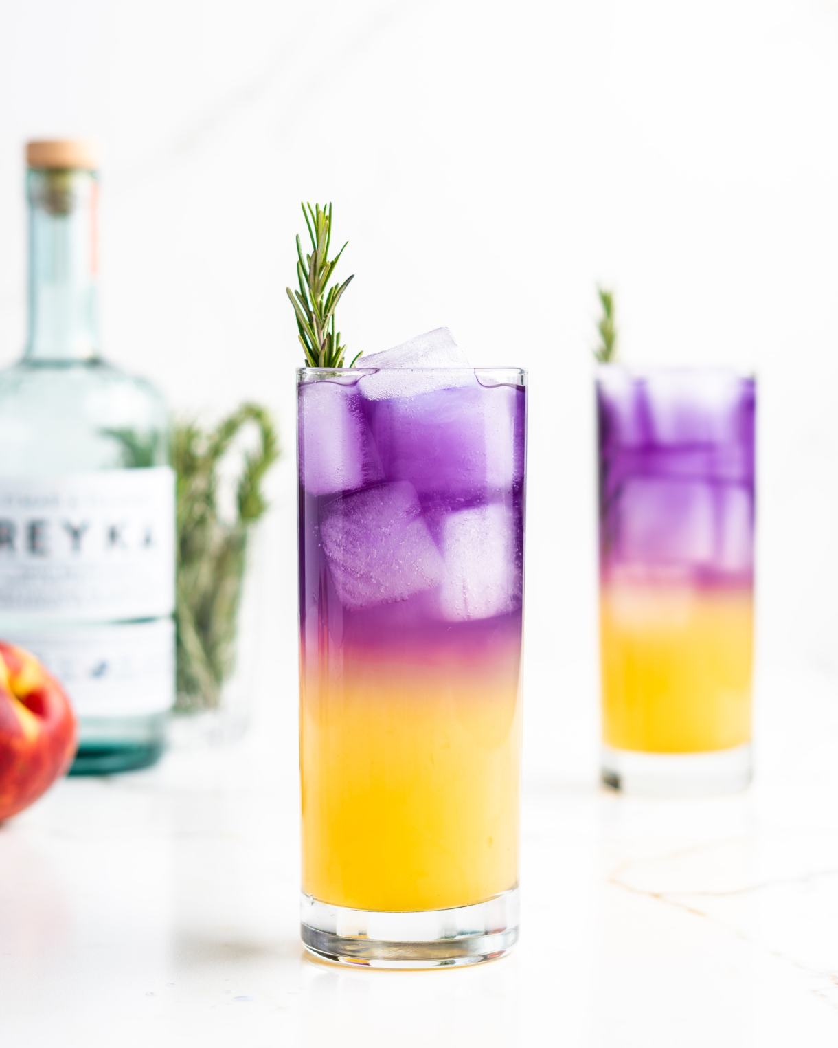
Passionfruit Fizz Picnic Punch via Food Duchess
After all the hard work you’ve put into decorating your interior and exterior, you definitely deserve a treat! What better way to celebrate your success than with an equally per-purple picnic punch. Pour yourself a fizzy refreshment and sit down to admire your glamorous new surroundings. Happy Spring!
Whether you’re preparing to BUY or SELL or want to learn about the current market trends, or want explore your current home value, Julie Harrison is here to help.