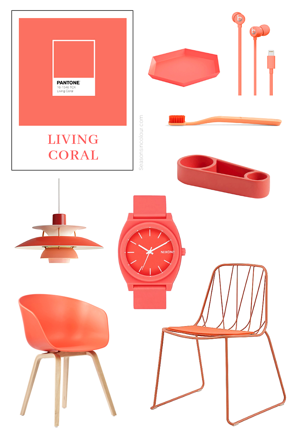
With literally endless colors to choose from, you might wonder what goes into picking Pantone’s Color of the Year and how ‘Living Coral’ was the winning choice for 2019.
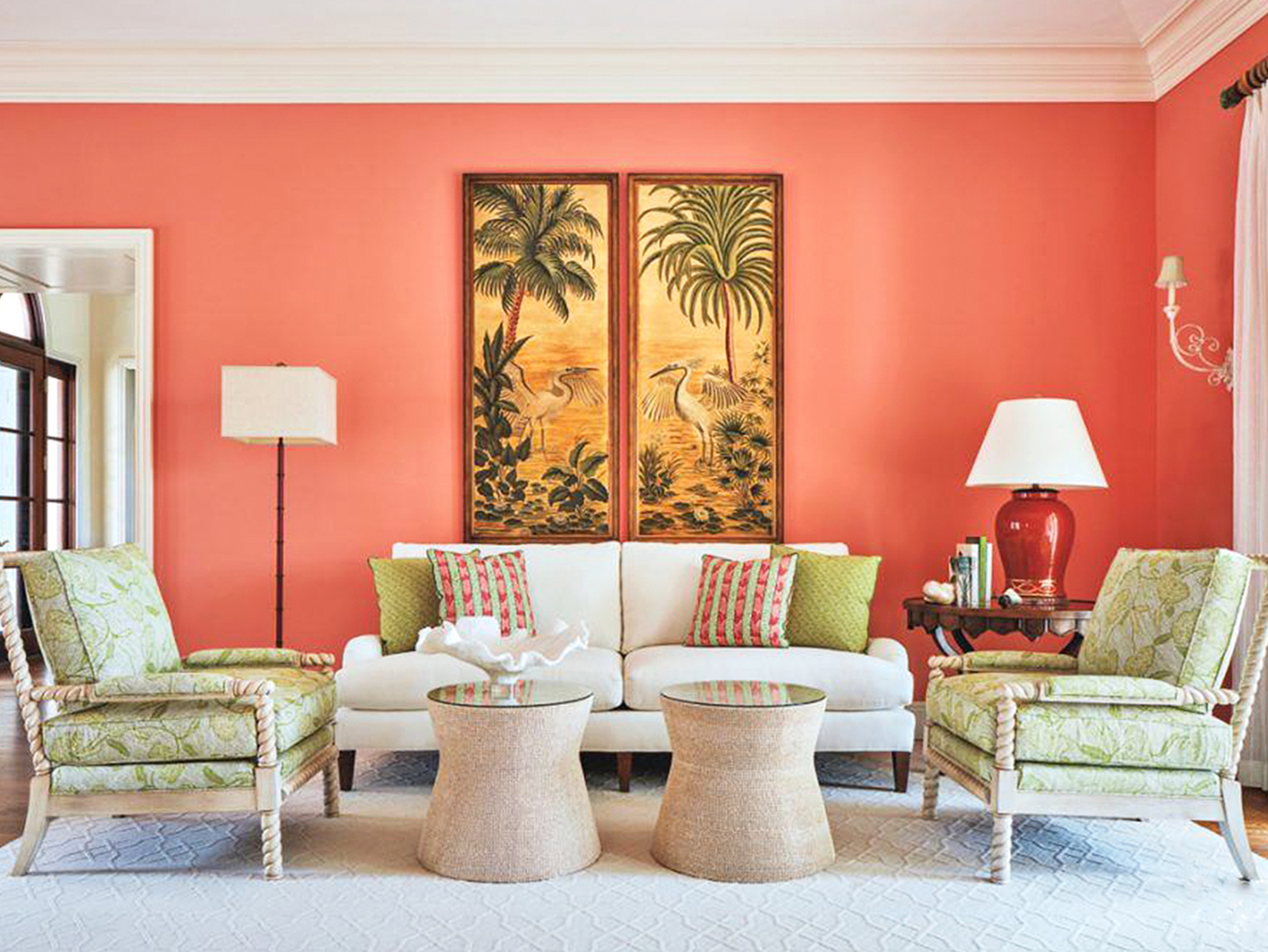
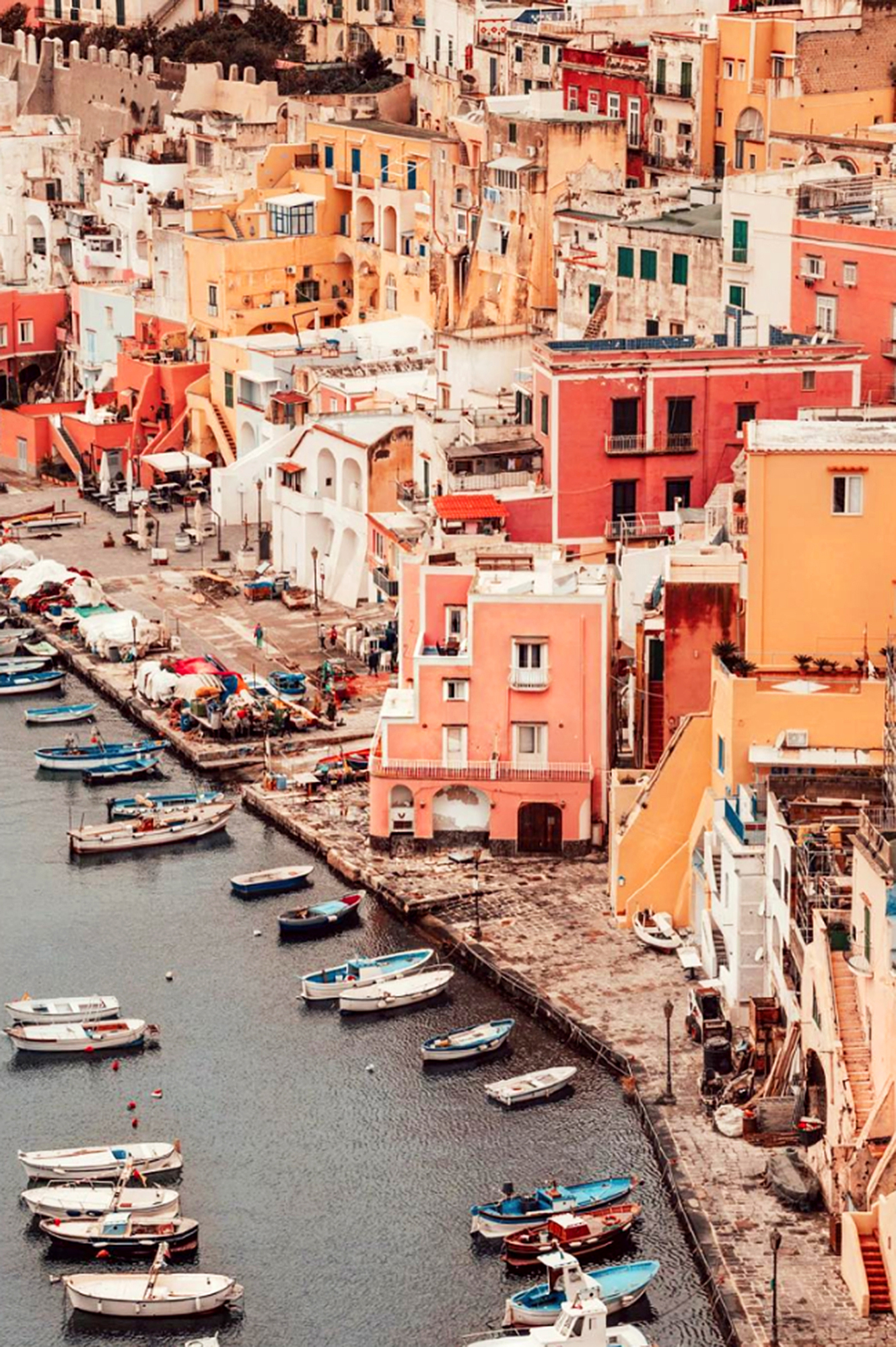
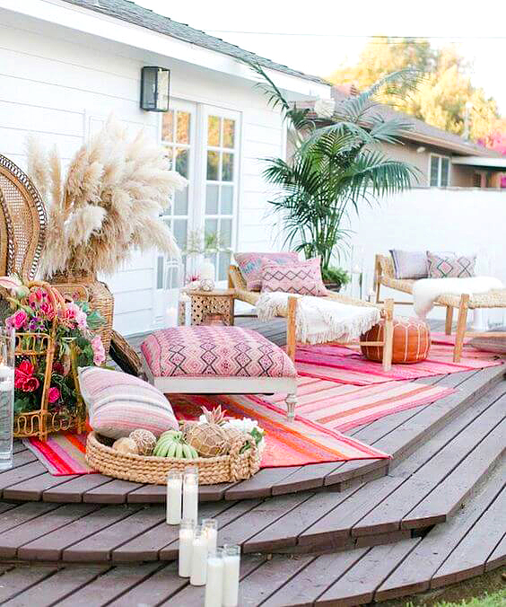
Tropical Retreat via Luxe Group
Elle Decor quotes Pantone experts as saying, “In choosing the color of the year, we look at everything around us. We look to see what people are doing in beauty and in fashion and in art; we look to see what people are wearing, and buying, and posting about on social media. In a time when so many of us are increasingly immersed in digital experiences that can be cold and isolating, Living Coral felt like an appealing shade of connection. There’s just something about the color that feels earthbound and welcoming, optimistic and intimate. And those are the exact reason’s Living Coral is so applicable in the home and design space.” We completely agree… and LOVE it!
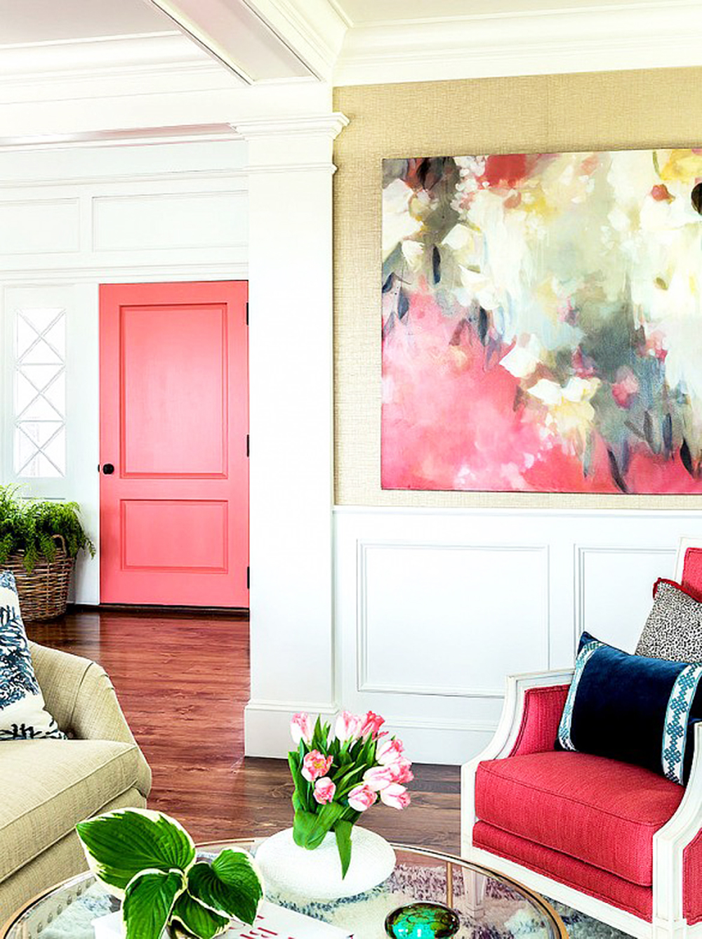
MIX BRIGHT WHITES WITH CORAL ACCENTS
Sherwin Williams 6606 Coral Reef via Thistlewood Farms Room Reveal
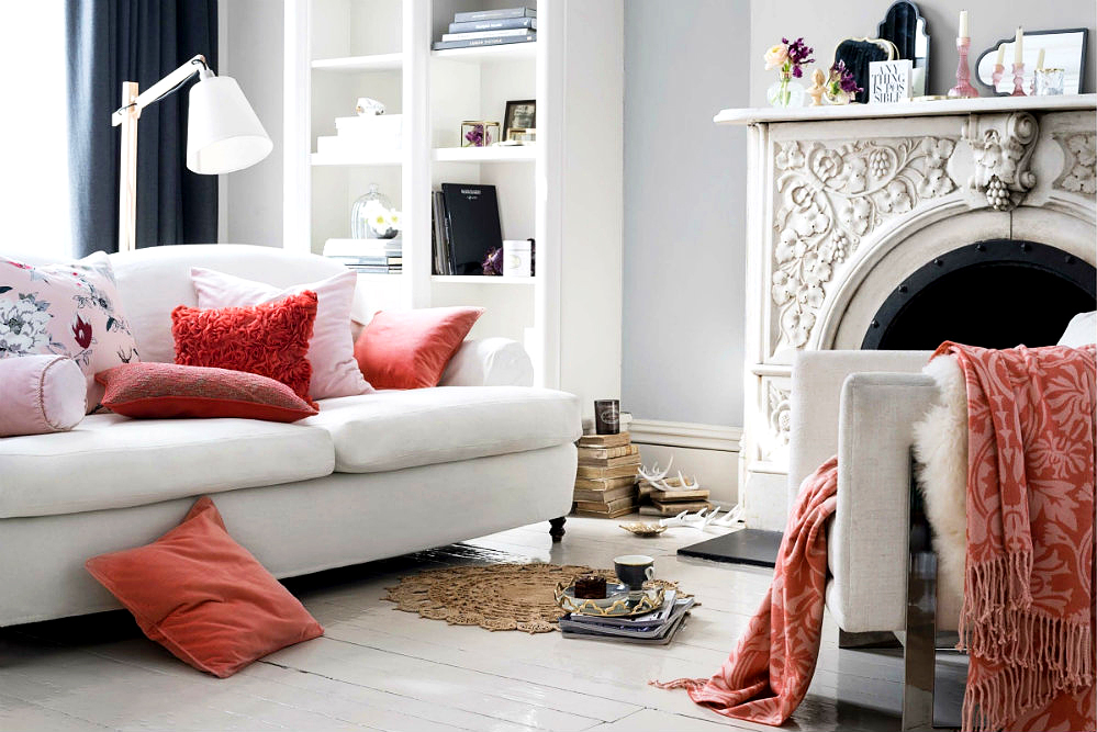
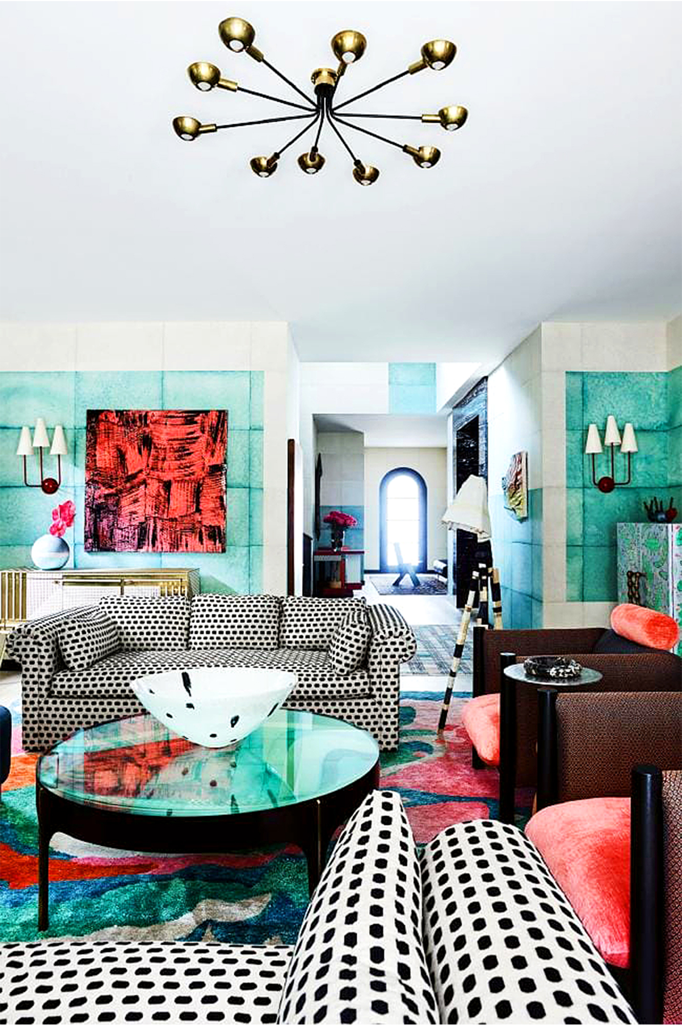
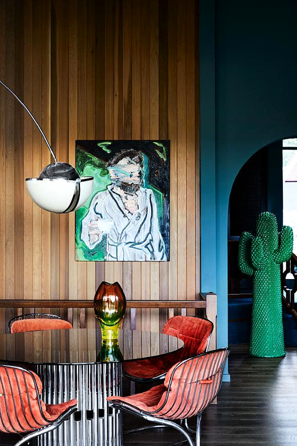
Not only does Coral go with earthy tones of nude, beige, bamboo and ivory, but it also fits right in with lush green nature-tones from bright lime, muted eucalyptus, minted hues, to deep evergreen. It goes with gem tones of sapphire, emerald and lapis or can be paired with southwest palettes of desert cactus, terracotta clay and watery turquoise. It’s strong enough to pair with the boldest of cohorts such as Fushia, Magenta, Fire Pink, Sun Yellow and Neon Orange. Its surprising versatility makes it one of the most appealing colors to work with on both large and small scales.
A MIXED VARIETY OF CORAL HUES
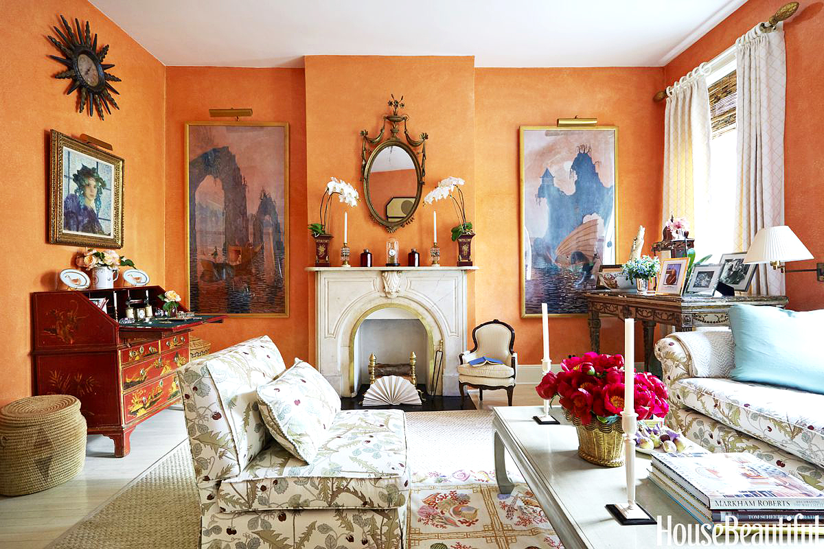
Shades of Pale Coral Terracotta via House Beautiful
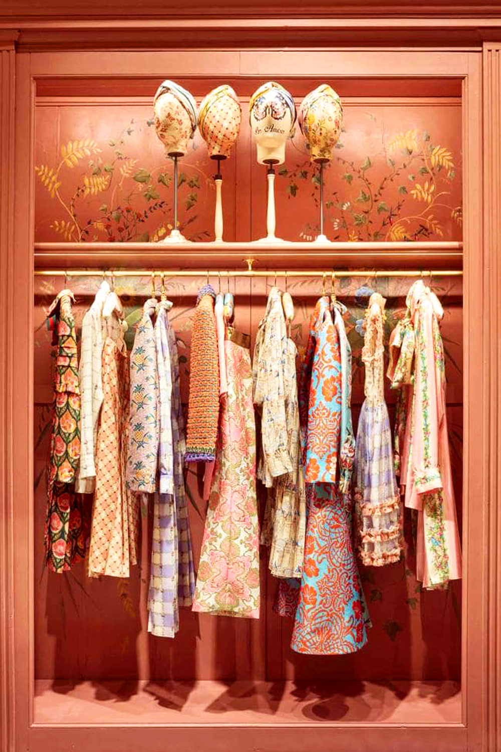
Stunning Wardrobe in Coral Shades via Vogue
MIX CORAL WITH SHADES OF AQUA AND GREEN
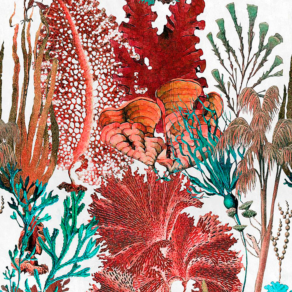
Coral Reef Wallpaper via Mind the Gap
Dramatic Dark Wood Aquamarine & Coral via Vogue
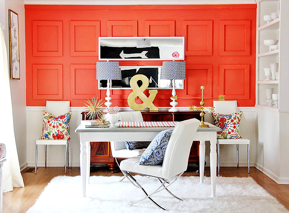
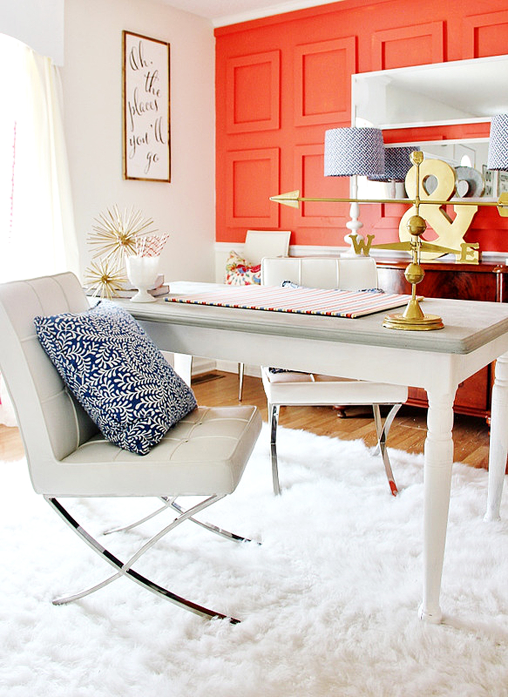
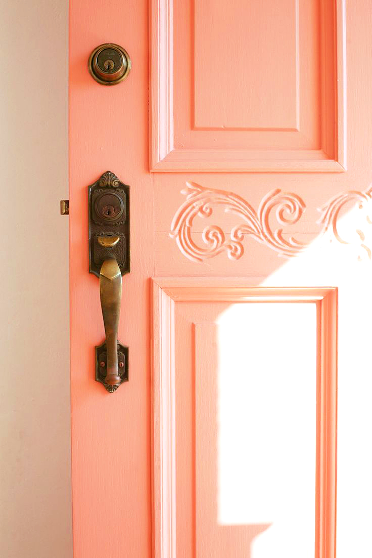
The best way to use this color? ANY WAY YOU WANT! Whether you choose to use it as an accent color throughout a particular space – indoors or outdoors – a little pop of this color goes a long way! But even with coral being so bright and bold, it’s still something folks will embrace on a grander scale because it’s a tone that demands the viewers attention. It works as a side dish, a tapestry, a patterned print, a chair, a full couch, an accent wall or a full painted room. It’s a shade you’ll want to live with and has lasting power, which is why Pantone chose it… and why they’re so skilled at what they do.
Coral Details via Seasons of Colour
Brass & Coral via Suburban Pop
Pink Coral Accents via Splendid Habitat
We looked around to see what interior design experts were recommending to decorators interested in working this this brilliant color into their space – and we were not disappointed with the suggestions. It’s easy to see why coral is a choice that offers an endless variety of options that have lasting power and style. Design trends for the year seem to really work well with coral – from black and white or monotone gray rooms, to neon pick or lush jungle-green accent walls that welcome a compliment kiss of coral.
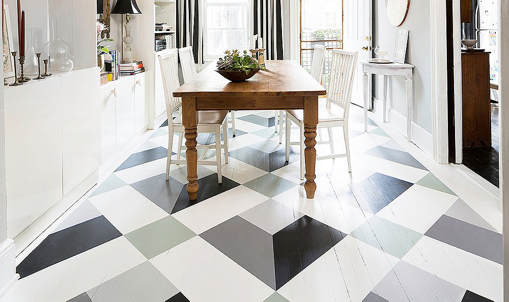
Black & White DIY Floors via One Kings Lane
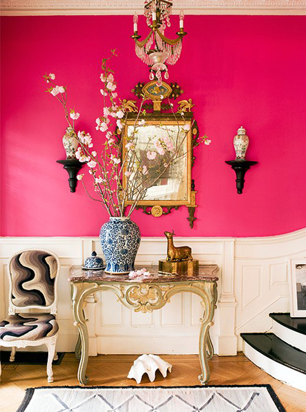
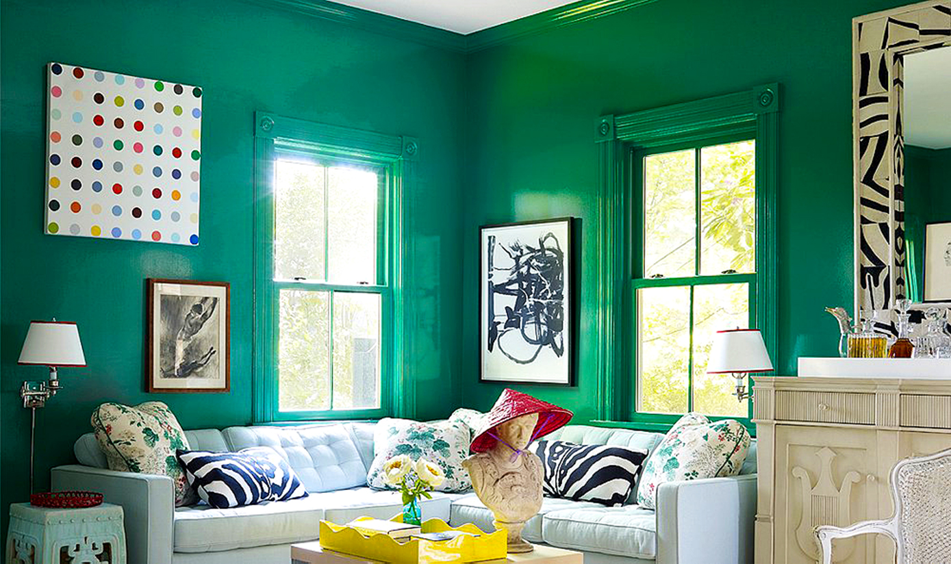
Jewel Tone Walls via One Kings Lane
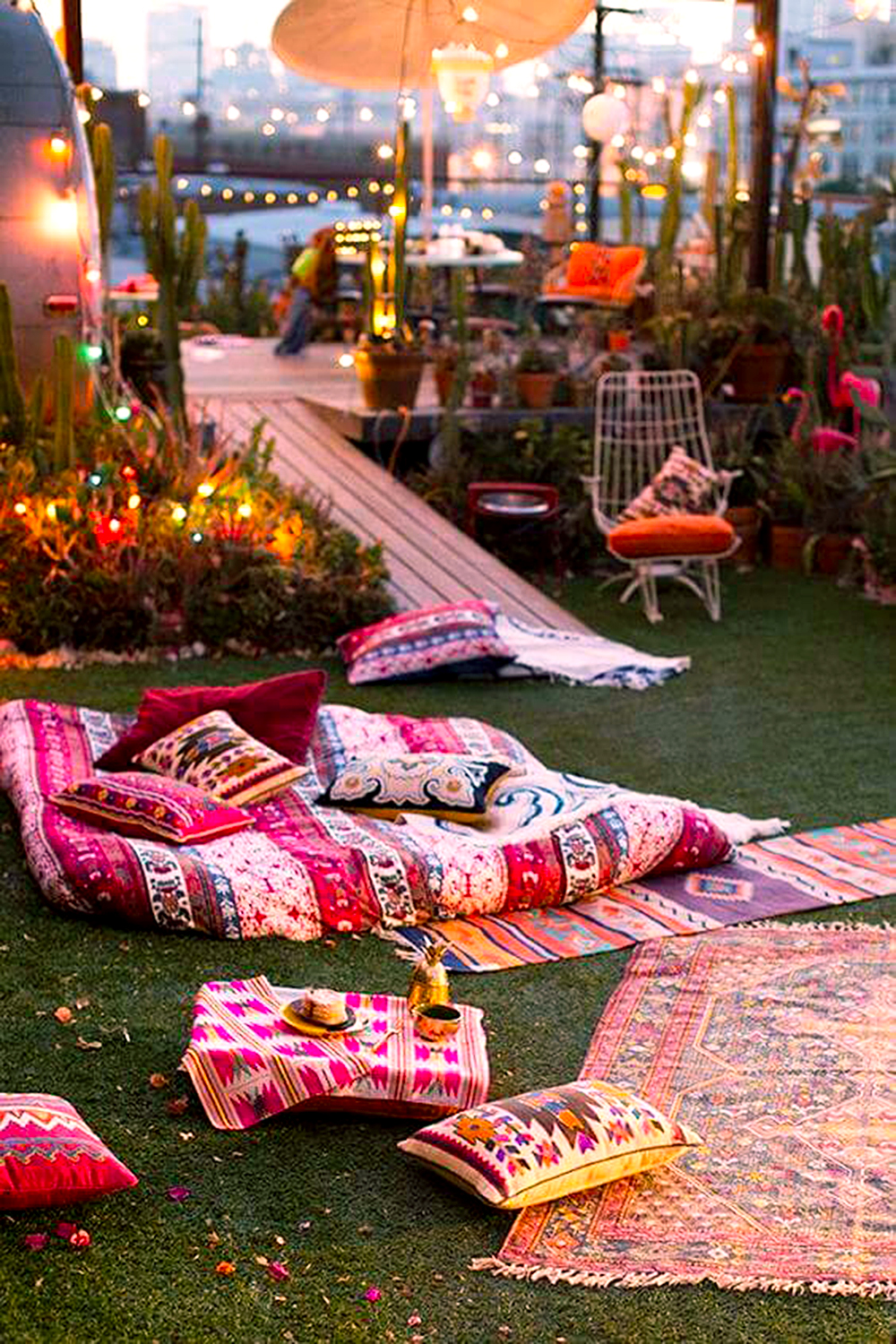
And we couldn’t resist some suggestions of how to incorporate this tropical beauty into your outdoor space. Use it as a throw or floor pillow, hanging lantern, or an area matte to go with garden greens or vibrant blossoms. Bold and bright hues to muted tones of terracotta all play beautifully off of each other and will compliment the best of nooks, landscapes, beach bungalows, patios, and secret gardens.
USING CORAL IN OUTDOOR SPACES
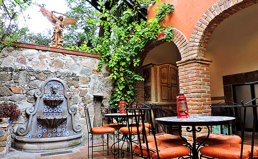
Outdoor Shades of Terracotta via Casa Colibri Terra
Outdoor Shades of Terracotta via Casa Colibri Terra
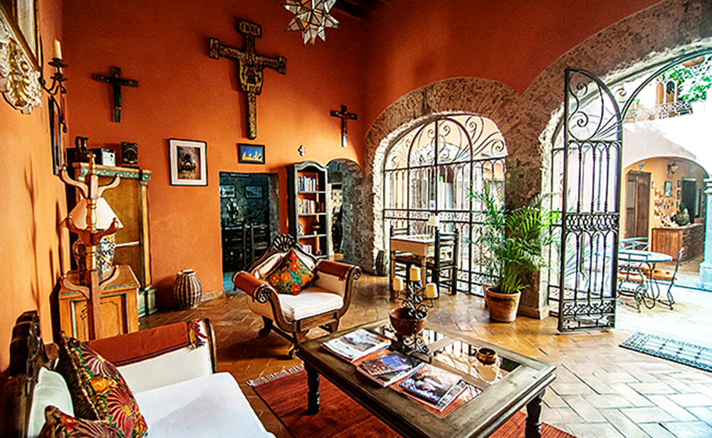
Coral Beach Bungalow via Elle Decor
Finally, a valuable tip to keep in mind? Always be on the lookout for inspiration. You never know what view might appear around a corner that’s a snapshot away from becoming your most favorite photograph turned decorating detail to tie your entire room together by it’s placement on a wall.
Coral Scape by Mango & Me Instagram via Vogue
Inspired by these outdoor spaces? Than you won’t want to miss our post about creating your own secret garden. See how to design an outdoor oasis of your very own… one that might even have a little touch of Living Coral! Read more here.
Coral Toned Outdoor Boho Inspiration via Backyard Master
INSPIRATION SOURCE
Luxe Daily – Tropical Retreat Coral Hues
Forbes – Designing with Pantone’s 2019 Color of the Year
Elle Decor – Living Coral
Vogue – 14 Tips for your New Coral Universe of Pantone’s C.O.Y.
Seasons in Colour – How to use Pantone’s Living Coral
Decor Pad – Coral Accent Wall
Splendid Habitat – Home Color Trends
Suburban Pop – Coral & Brass Combos
One Kings Lane – Jewel Tones
One Kings Lane – Black/White/Gray Floor Pattern DIY
Backyard Master – 31 BOHO Inspired Outdoor Spaces